Our website is not completely matching our brand roadmap. The reason why we decided to do it this way is because we believe the design of our brand roadmap no longer matches our brand. The production assignment forced us to really look at our brand and to keep improving. This resulted in our design, which is more sophisticated and looks more professional than the design of our brand roadmap. We also asked feedback from both lecturers and students. They replied that it did not look very professional due to, for example, the fonts and boxes (see image on the right). This confirmed what we had in mind and we believe we made the right decision.
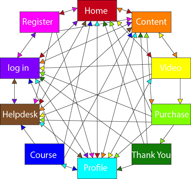
With the flow of our website we wanted to make everything accessible in an easy way, the navbar features all the important elements and the page not connected are easy to access via corresponding pages. The three flows are website has are “home page – register – profile” “content – video – purchase – thank you” “profile – course”.
The first flowchart and prototype can be found in our paper prototype.
Open Paper PrototypeThe layout of the page follows the flow chart shown above. It has been adjusted with the received feedback with addition of pages such as registration, or purchase. The layout follow's a structure on each page with similar margins, paddings and headings to bring coherency to the flow of the website. However, the justification page doesn't follow the same structure. In testing, the layout of the website has been called appealing and flowy, which makes us believe that we designed a consistent website.
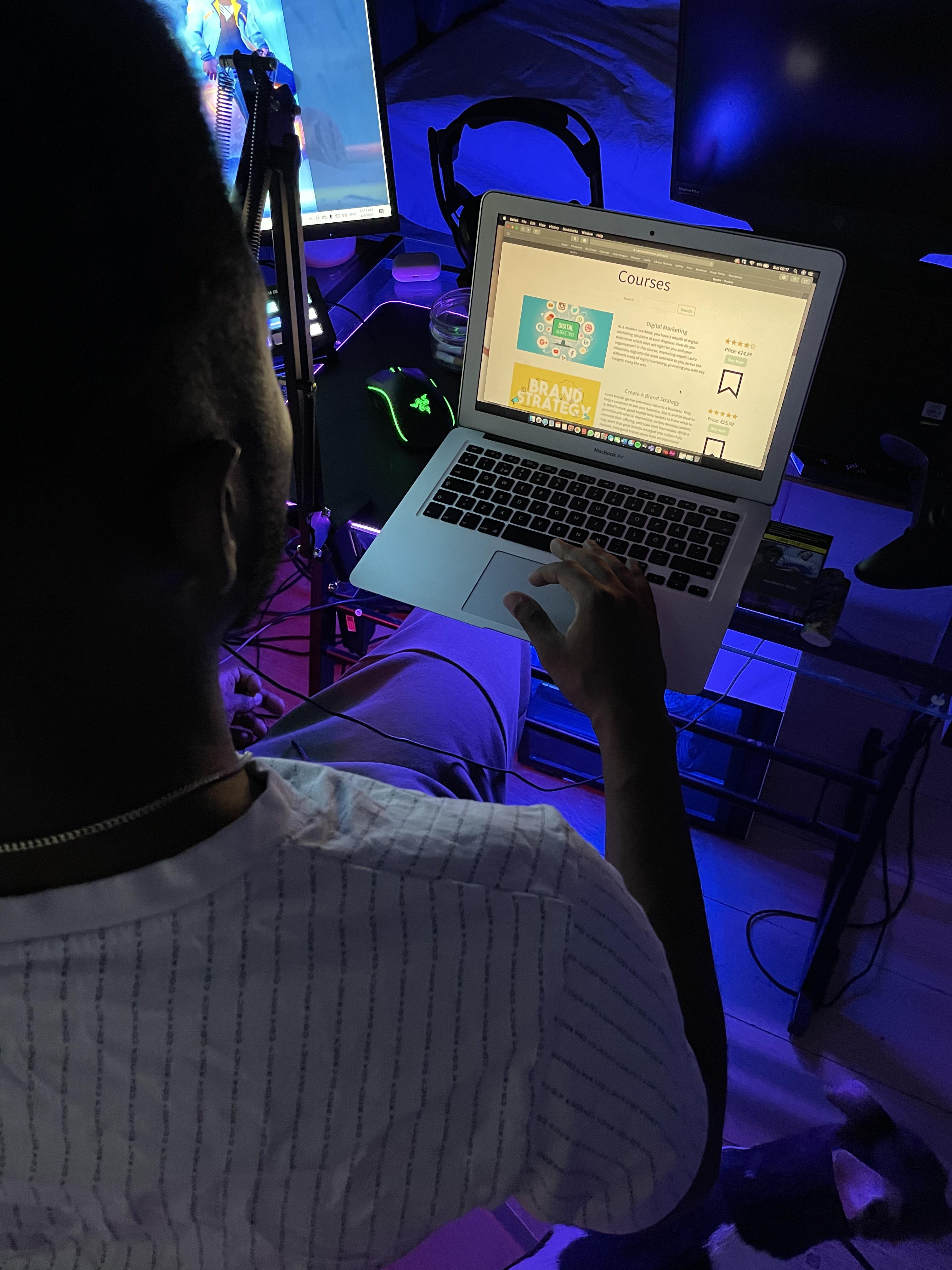
We tested six people. These participants are all people who are used to using the internet and have a basic understanding on how websites are structured. We decided to use a digital prototype because this gives us the most relevant view on how people behave and react when using our website. We gave our test participants a task so we could test if people are able to, for example, buy a course.
Esther's task was to find a brand strategy course and purchase it. She immediately understood to go to the 'courses' page by clicking 'courses' in the navigation bar. She also found the brand stratey course very fast. After clicking 'buy now' she entered the purchasing page. Then she wanted to finish the payment, but there was no button.
After this testing round we improved the purchasing page by adding a button to finish the payment which will lead to a page that confirms the payment.
Amy had the task to test the log in and register page. Furthermore, she's been asked to test the course page and purchase a course. The objective of the test was to let her experience every side of the website and all its functions. Despite she found everything clear and easy to do, she suggested to adjust the alignments between the elements of the website. Her feedback has been applied and we tried to make all the pages more coherent and well presented.
Fleurs Task was to make a new acount and later to buy a course, she navigated trough the site without problems and was able to complete the tasks
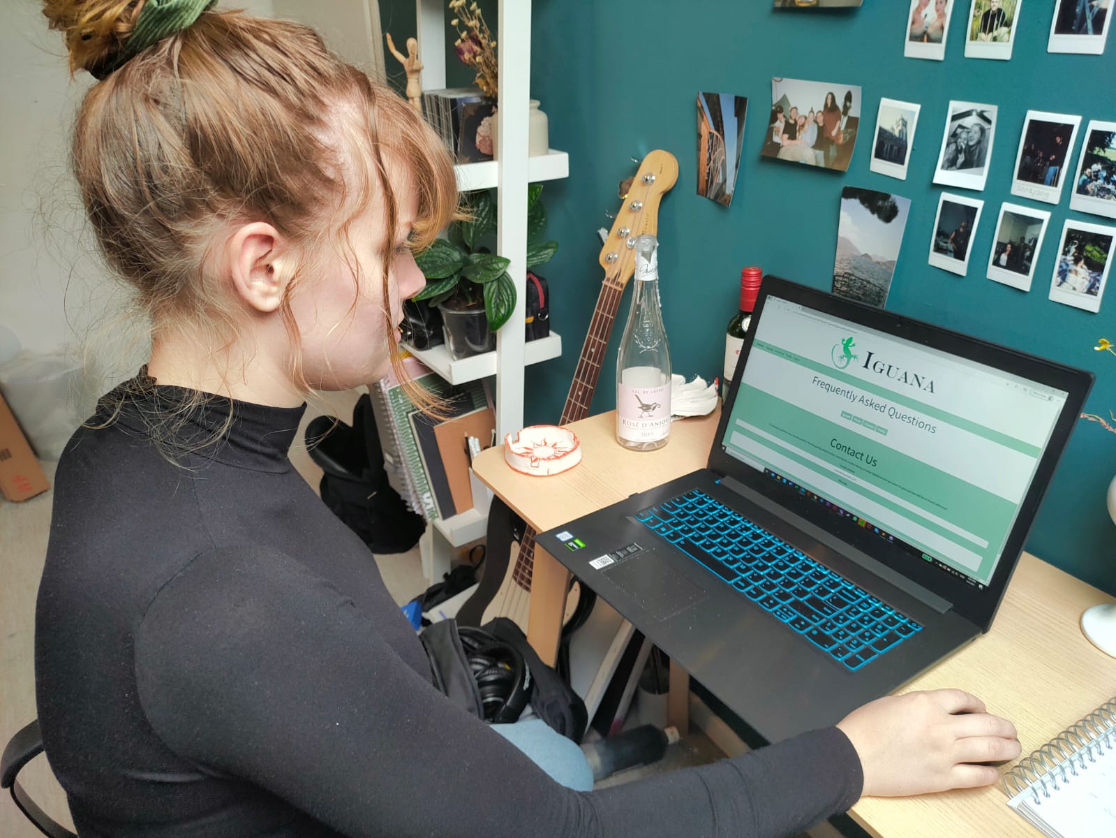
Bennie was asked to make a new acount and found it difficult to get himself registrated, he did not find the main streams towards the register page but went to the helpdesk. On the helpdesk page we added a link to the register page. He did not have any trouble buying a course.
Napoleon's task was to purchase a course to watch and to try to contact the customer service. Despite some confusions on the purchase page, he found his way through to purchase a course. For feedback, he mentioned that the purchase page was confusing with where it leads next. Regarding the contacting, Napoleon couldn't make the collapse buttons on helpdesk work (issue fixed later) and was able to send a message through the contact box.
Valeria's task was to go through the home page and try to register for a new account. She found the home page very dynamic and appealing. The registraion was easy to find through the jumbotron on the home page. Later on, Valeria was asked to save a course to her profile, which she found easy to do. However, she said that the saving button would look better with making it interactive and change colour when hovering over with mouse, like the other buttons. She mentioned that this is just a small detail that would make it nicer.